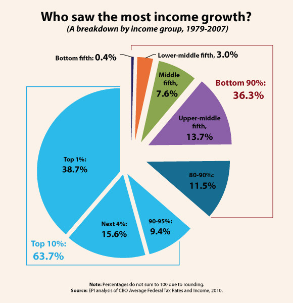
Economic Policy Institute gives us a simple chart:
38.7% of all of the income growth accrued to the upper 1% over the 1979-2007 period: a greater share than the 36.3% share received by the entire bottom 90% of the population.
Those in the top 10% of the income scale received 63.7% of all the income growth generated over the 1979-2007 period. In contrast, the bottom 20% of all earners saw such a small share of income growth – just 0.4% – that it barely shows up on the included pie chart.
Let’s repeat: over the last ~30 years, the top 10% got about 60% of all income growth. Everybody else: not so much.
There should be no speech, no appearance, no utterance, no anything involving any Democrat anywhere a camera, microphone, or goodly crowd may gather that does not include this chart. Every time, every day, every hour between now and November.
Don’t hold your breath.
