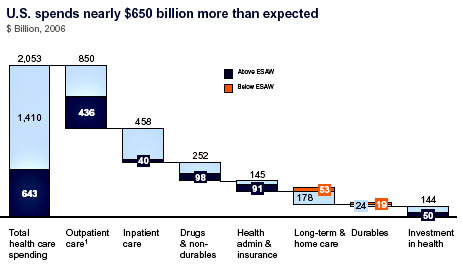
Kevin Drum provides a link to this excellent chart (dark blue where we spend more than expected, orange where we spend less than expected, lighter-blue what we should expect to spend adjusted relative to our economy/population/and other systems). He also helpfully cites the specific line-items that ultimately cause us to spend more on (and yet still get less from) healthcare in this country:
- We pay our doctors about 50% more than most comparable countries.
- We pay more than twice as much for prescription drugs, despite the fact that we use less of them than most other countries.
- Administration costs are about 7x what most countries pay.
- We perform about 50% more diagnostic procedures than other countries and we pay as much as 5x more per procedure.


