
The shadows are a bit much, but this is more like it.
The shadows are a bit much, but this is more like it.
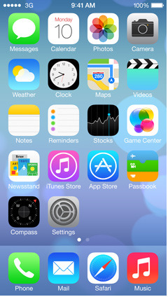
The Ugly: I think any rational person would agree that Safari, Notes, and Maps all have pretty terrible icons in this regime. Safari is just astoundingly bad. Anything else would be preferable. And at least the little idiotic wooden newsstand showed me some (albeit tiny) tidbits of information. Let’s replace that minor utility with white space. Huzzah!
The Bad: Settings is change for change’s sake and, again, not a change for the better. Photos makes no sense in the abstract, other than as an additional abstraction of the previously nonsensical flower icon.
Flattening does no favors to Phone, Messages, Videos, iTunes Store, App Store, Mail, and Music. The gradients on the latter five are, uh, poor choices to my eye. People’s animus against (boredom with?) gloss seems to have metastasized into these flat gradients. Hope you’re happy with that. Camera now inexplicably looks like an SLR of some kind. The essential nature of the thing is far closer to the current icon, Jony. Which looked like an iPhone camera.
The Good: I guess Calendar is pretty good. Weather does the job. Passbook also looks like the work of a modern master in comparison to the rest of this lot. Clock is essentially unchanged and Compass looks fine.
But, hey, at least we got rid of leather, felt, and stitching. Right? After all, Game Center is now a totally sensible collection of randomly colored blobs of various sizes. Where else would you visually decide to click for your Game Centering needs? Big usability and interpretability win there. Right?
All the semi-transparency in the demos did nothing to allay that old sinking feeling. Officially worried the unwinding is upon us.
A formally coherent product needs no decoration, it should be elevated through pure form.


It doesn’t matter how amazing the steak is, if it’s served on a cold plate it’s crap. If it’s served with a dull knife it’s crap. If the gravy isn’t piping hot, it’s crap. If you’re eating it on an uncomfortable chair, it’s crap. If it’s served by an ugly waiter who just came in from a smoke break, it’s crap. Because I care about the steak, I have to care about everything around it.
Nice, but I have a few questions right out of the boxee:
